

Designing a user interface (UI) system means that you need to look at and detail the design choices of multiple systems in a systematic way to see what works and what doesn’t. Many people can point to good and bad UI design in software and explain how or why it is bad. Rarely though is the real world talked about when looking at bad UI and bad user experience (UX) when speaking about software design.
UI is supposed to make it so the user can tell what an object does or provides based on its appearance. Once this is broken it leads to bad UX. At their core, the majority of our UI elements are based in real world analogs (skeuomorphism). Therefore, it is important that we look at how objects are designed which will hopefully lead to the development of a UI that results in a good UX.
Good UI/UX in the real world is plentiful. If a product has bad UI/UX, it disappears, where good UI/UX is copied and even standardized. That makes the study of bad UI/UX in the real world all the more important since it is so rare. Even something as simple as a light switch can have bad UI/UX. Case in point this Lutron Dimmer switch:

Lutron CL dimmer switch has what people would consider bad UX.
For these dimmer switches they essentially have two buttons (Up and Down) and three states. The states are On (max light level), Set (user settable light level) and finally Off (zero light level). For this study we are going to ignore the other two buttons present which allows you to fine tune the light level. Looking at these two buttons and three states we can construct essentially a truth table looking all the operations that can be performed with the dimmers two buttons. Table 1 would be what most people would construct:
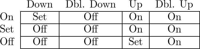
Table 1: Ideal dimmer switch truth table.
The above table makes sense to most people. If it is in the On state and you press up nothing should happen. Same goes with the Off state and you press down. If you are at either extreme and you press the button in the opposite direction you end up at the user Set state. Double clicking in either direction will allow you to bypass the Set state and hit one of the extremes. Compare this to the Lutron Truth table:
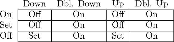
Table 2: Lutron CL dimmer switch truth table. What is going on?!?
The first thing you notice is that you can’t get to the On state without double clicking. This thing is poorly designed and logic is so incomprehensible it is to the point where one would immediately question is the accuracy of the truth table. I can assure you it is correct.
How did this get built? Where is the logic? Looking at the truth table it is hard to discern. That is only because the UI (two buttons) is hiding the underlying logic. There is only one button in the logic. If we build the Lutron truth table assuming that both Up and Down are the same button, the truth table is:
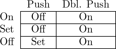
Table 3: Single button Lutron dimmer switch truth table.
Press the button and it goes to the Off state, unless it is already in the Off state then it goes to the Set state. You need to push the button twice to go the On state.
This makes sense. However, since there is a breakdown between the UI (two buttons) and the underlying logic (one button) it has resulted in bad UX. This is why something as simple as a light switch needs to be looked at for the lessons it can teach us. In this case UI should always match the underlying logic or it leads to confusion.